Loading required package: ggplot2ggplot(data = iris)
Material for this lecture was borrowed and adopted from
Last time we discussed the elements of plotting in the R base graphical system. The base functions such as plot() open a new plot window and set up the coordinate system, axes, and often return the default plot. Annotations can be added onto a plot with additional functions such as points(), lines(), text(), etc. Many other plotting functions exist too, you can check out the graphics package https://rdocumentation.org/packages/graphics/versions/3.6.2. Or type ?graphics at the R prompt and check out the help page index.
Today we will learn about the ggplot2 package written by Hadley Wickam https://hadley.nz. ggplot2 introduces a new syntax for plotting, based on the idea of a grammar of graphics. The idea is that the user supplies the data, specifies how ggplot2 maps variables to aesthetics, what graphical primitives or types to use, and it takes care of the details. The grammar of graphics builds plots in layers.
Just as in spoken language, where a beginner can form many sentences from only learning a handful of verbs, nouns and adjectives, using the ggplot2 grammar, even beginners can create hundreds of different plots.
Note that ggplot2 is part of the tidyverse and thus is designed to work exclusively with data tables in tidy format (rectangular data where rows are observations and columns are variables).
Being literate in ggplot2 requires using several functions and arguments, which may not make sense at first. The ggplot2 cheat sheet can be super helpful: https://posit.co/wp-content/uploads/2022/10/data-visualization-1.pdf or google “ggplot2 cheat sheet”.
The first step in learning ggplot2 is to understand the basic elements of the grammar:
A ggplot2 plot consists of a number of key components.
geoms define the style of the plot such as scatterplot, barplot, histogram, violin plots, smooth densities, qqplot, boxplot, and others.Nearly all plots drawn with ggplot2 will have the above compoents. In addition you may want to have specify additional elements:
Facets: When used, facets describe how panel plots based on partions of the data should be drawn.
Statistical Transformations: Or stats are transformations of the data such as log-transformation, binning, quantiles, smoothing.
Scales: Scales are used to indicate which factors are associated with the levels of the aesthetic mapping. Use manual scales to specify each level.
Coordinate System: ggplot2 will use a default coordinate system drawn from the data, but you can customize the coordinate system in which the locations of the geoms will be drawn
Plots are built up in layers, with the typical ordering being
ggplot2 works by creating a ggplot object that can you can then add to. The ggplot() function initializes the graph object, usually by specifying the data. See the ?ggplot help page.
Weʻll start by loading the ggplot package and using the built-in iris dataset.
Another way to send data to the function is through piping. These are both equivalent to the line above:
The %>% is the older pipe operator, but you will start to see |> more often now too.
You have sent data to ggplot() but it is a blank canvas because you have given it no geometry to plot (no points, bars, etc.)
It is an object, so you can save it to a named variable, say p:
To render the plot associated with this object, we simply print the object p. We can do this in interactive mode by simply typing p at the command line or using the print() function. However, in a script, you will want to use the print() function, and typically print it to a pdf device.
Additional components are added in layers, which is to say, separate R statements added on to the object with the + operator. Layers are very flexible and can define geometries, compute summary statistics, define what scales to use, or even change styles.
A template for creating a plot with layers would look like this:
DATA |> ggplot() + LAYER1 + LAYER2 + … + LAYERN
To save it to a ggplot object, say p:
p <- DATA |> ggplot() + LAYER1 + LAYER2
Or if you want to save different varieties of objects or at different stages, just assign them to different names:
q <- p + LAYER3
r <- p + LAYER4
The geometry specifies the geometrical elements such as points, lines, etc. which in turn determines the kind of plot that we want to make. If We want to make a scatterplot. What geometry do we use?
Taking a quick look at the cheat sheet, we see that the function used to create plots with this geometry is geom_point.
It will take you a bit to get familiar with the naming conventions, but with them you can use some powerful tools.
Geometry function names follow the pattern: geom_ followed by the name of the geometry. Some examples include geom_point, geom_bar, and geom_histogram.
For geom_point to run properly we need to provide data and a mapping. We have already connected the object p with the iris data table, and if we add the layer geom_point it defaults to using this data.
To find out what mappings are expected, jump down to the Aesthetics section of the help file geom_point help file. It states that the required aesthetics are in bold. Which arguments are required?
?geom_pointIt should come as no surprise that to make points appear, you need to specify x and y.
Aesthetic mappings connect elements of the data with features of the graph, such as distance along an axis, size, or color.
The aes() function, used inside of a geom is where the mappings happen, that is where data are connected with graph elements through defining aesthetic mappings (you will see this lingo a lot).
To produce a scatterplot of Petal.Length by Petal.Width we could use:
iris |> ggplot() +
  geom_point(aes(x = Petal.Length, y = Petal.Width))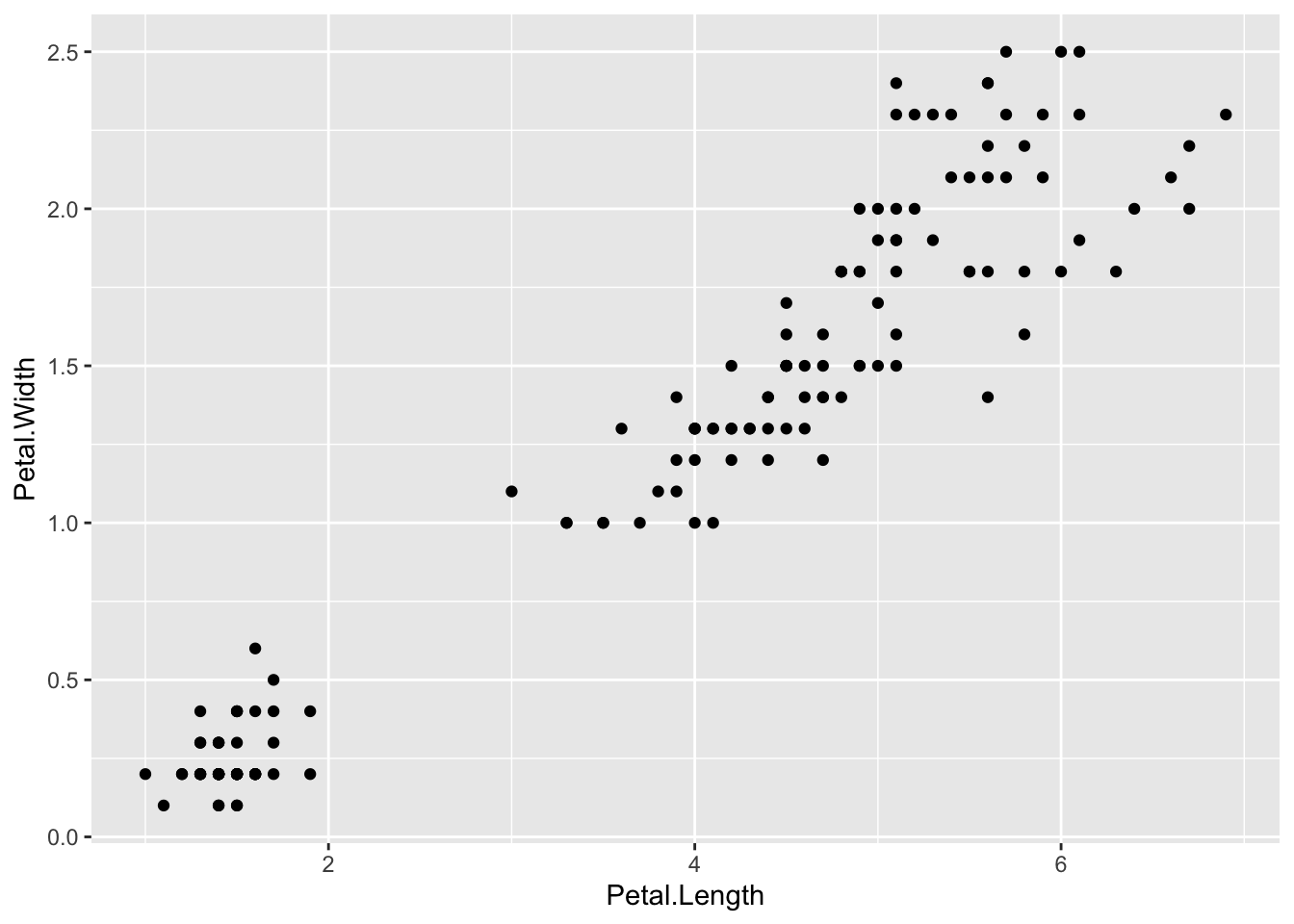
We can drop the x = and y = if we wanted to since these are the first and second expected arguments, as seen in the help page.
Instead of defining our plot from scratch, if we save the object as p we can also add a layer to the p object. The lines below produce the same plot (verify yourself):
p <- ggplot(data = iris)
p + geom_point(aes(Petal.Length, Petal.Width))
Nothing else was specified, so the scale and labels are defined by default when adding this layer. aes uses the variable names from the vectors within the data object: we donʻt have to call them as iris$Petal.Length and iris$Petal.Width.
The behavior of recognizing the variables from the data component is quite specific to aes. With most functions, if you try to access the values of Petal.Length outside of aes you receive an error.
Suppose we wanted to label each point on the plot. First we add numbers to the iris data and remake the ggplot object:
  Sepal.Length Sepal.Width Petal.Length Petal.Width Species id
1          5.1         3.5          1.4         0.2  setosa  1
2          4.9         3.0          1.4         0.2  setosa  2
3          4.7         3.2          1.3         0.2  setosa  3
4          4.6         3.1          1.5         0.2  setosa  4
5          5.0         3.6          1.4         0.2  setosa  5
6          5.4         3.9          1.7         0.4  setosa  6
The geom_label and geom_text functions add text to the plot with and without a rectangle behind the text, respectively.
Because each point has a label (id), we need an aesthetic mapping to make the connection between points and labels. By reading the help file, we learn that we supply the mapping between point and label through the label argument of aes. So the code looks like this:
p <- iris |> ggplot() +
  geom_point(aes(Petal.Length, Petal.Width)) +
  geom_text(aes(Petal.Length, Petal.Width, label = id))
p 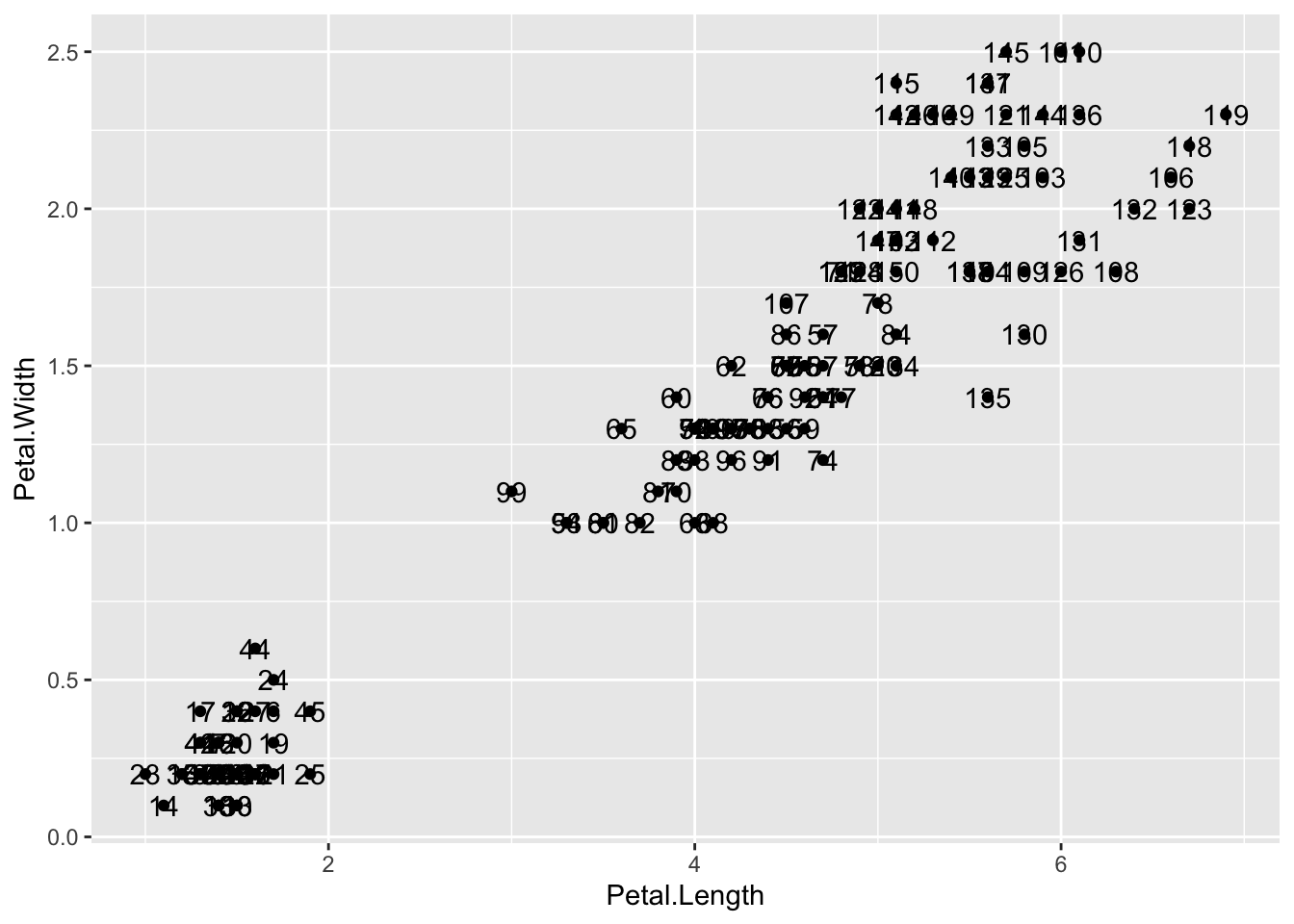
Itʻs a mess because there are many identical points, but you can see how it works.
Pay special attention to what goes inside and outside of the aes().
Note:
Works, but moving label=idoutside of the aes() does not:
The variable id is only understood to be part of the original dataframe inside of aes(). More on this later.
In the previous example, we define the mapping aes(Petal.Length, Petal.Width) twice, once in each geometry.
If the same mapping applies to each component of the plot, we can use a global aesthetic mapping. Generally we do this when we define the blank slate ggplot object. Remember that the function ggplot contains an argument that permits us to define aesthetic mappings:
args(ggplot)function (data = NULL, mapping = aes(), ..., environment = parent.frame())
NULLIf we define a mapping in ggplot, all the geometries that are added as layers will default to this mapping. We redefine p:
and then we can simply write the following code to produce the previous plot:
p + geom_point(size = 3) +
  geom_text(nudge_x = .15)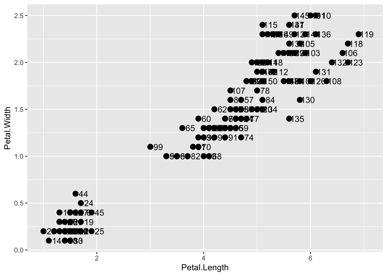
We keep the size and nudge_x arguments in geom_point and geom_text, respectively, because we want to only increase the size of points and only nudge the labels. If we put those arguments in aes then they would apply to both plots. Also note that the geom_point function does not need a label argument and therefore ignores that aesthetic.
If necessary, we can override the global mapping by defining a new mapping within each layer. These local definitions override the global. Here is an example:
p + geom_point(size = 3) +
  geom_text(aes(x = 2, y = 2, label = "Hello there!"))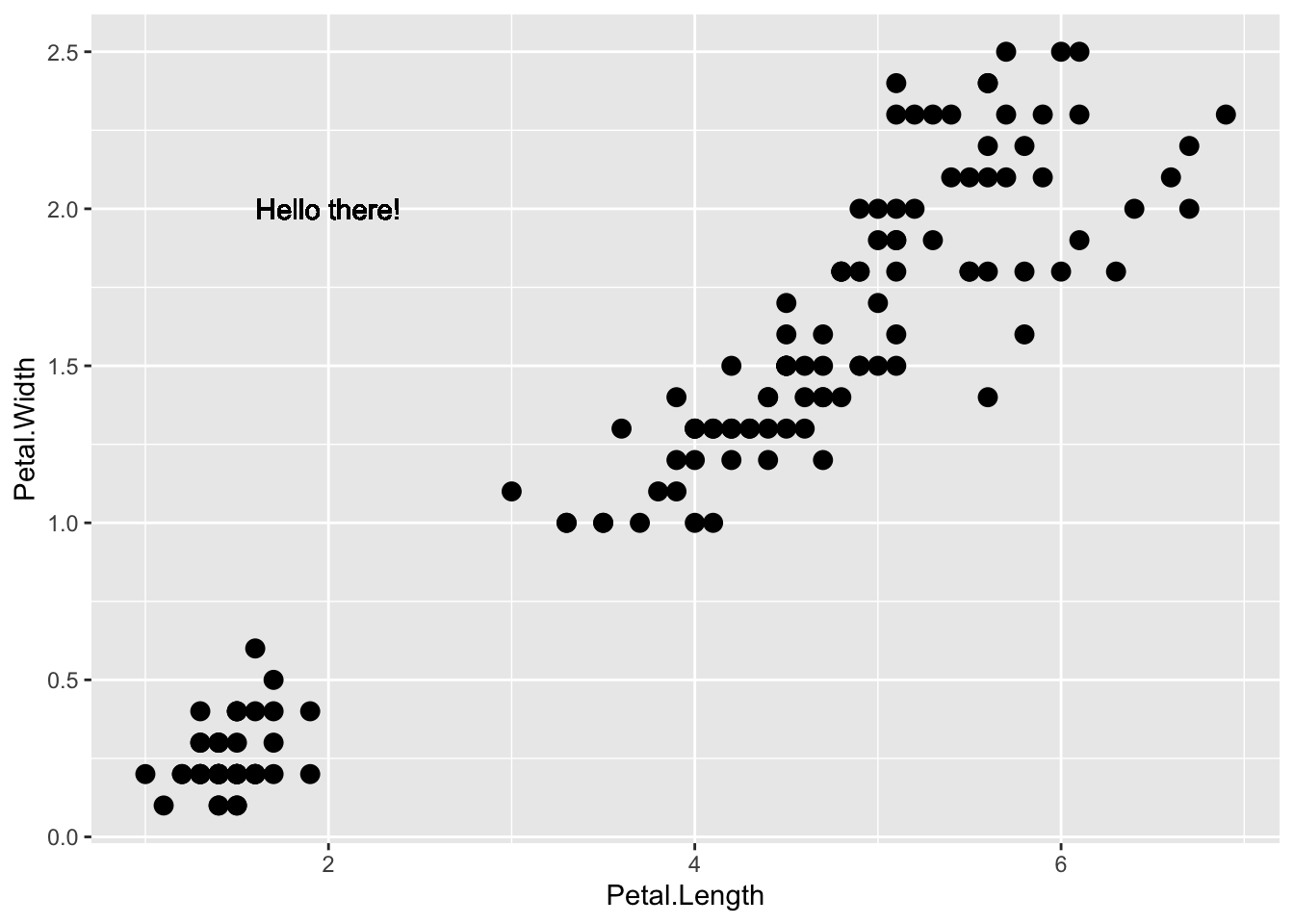
Clearly, the second call to geom_text does not use population and total.
Changing scales is a common task. For example, in morphometrics, we often use a log scale. We can log transform the plot (how it looks without changing the data) through a scales layer. A quick look at the cheat sheet reveals the scale_x_continuous function lets us control the behavior of scales. We use them like this:
p + geom_point(size = 3) +
  geom_text(nudge_x = 0.05) +
  scale_x_continuous(trans = "log10") +
scale_y_continuous(trans = "log10") 
Because we are in the log-scale now, the nudge must be made smaller.
This particular transformation is so common that ggplot2 provides the special functions scale_x_log10 and scale_y_log10:
p + geom_point(size = 3) +
  geom_text(nudge_x = 0.05) +
  scale_x_log10() +
scale_y_log10() 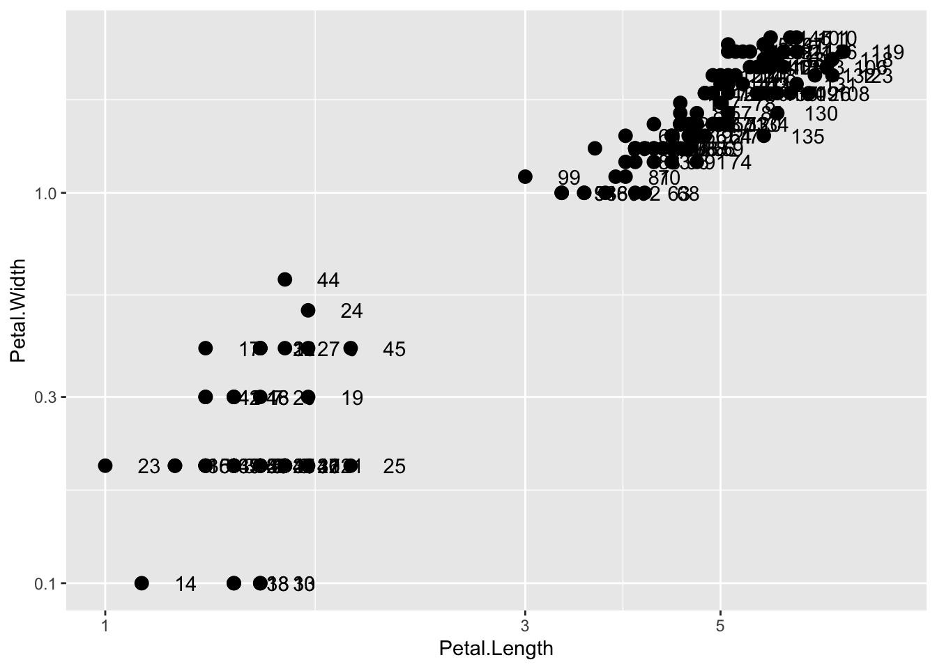
Similarly, the cheat sheet shows that to change labels and add a title, we use the following functions:
q <- p + geom_point(size = 3) +
  geom_text(nudge_x = 0.05) +
  scale_x_log10() +
  scale_y_log10() +
  xlab("Petal Length (log scale)") +
  ylab("Petal Width (log scale)") +
  ggtitle("Fisherʻs Iris dataset")
We are almost there! All we have left to do is add color, a legend, and optional changes to the style.
We can change the color of the points using the col argument in the geom_point() function. To facilitate demonstration of new features, we will save the log-scaled plot as q and include everything except the points layer:
q + geom_point(size = 3, color ="blue")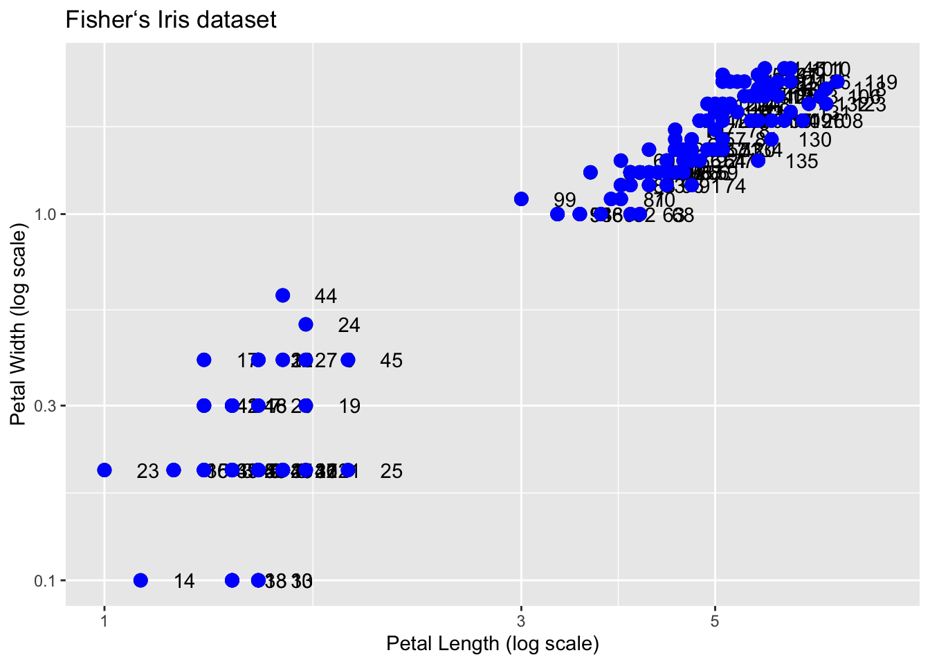
This, of course, is not what we want. We want to assign color depending on the Species. A nice default behavior of ggplot2 is that if we assign a categorical variable to color, it automatically assigns a different color to each category and also adds a legend.
Since the choice of color is determined by a feature of each observation, this is an aesthetic mapping. To map each point to a color, we need to use aes. We use the following code:
q + geom_point(aes(col=Species), size = 3)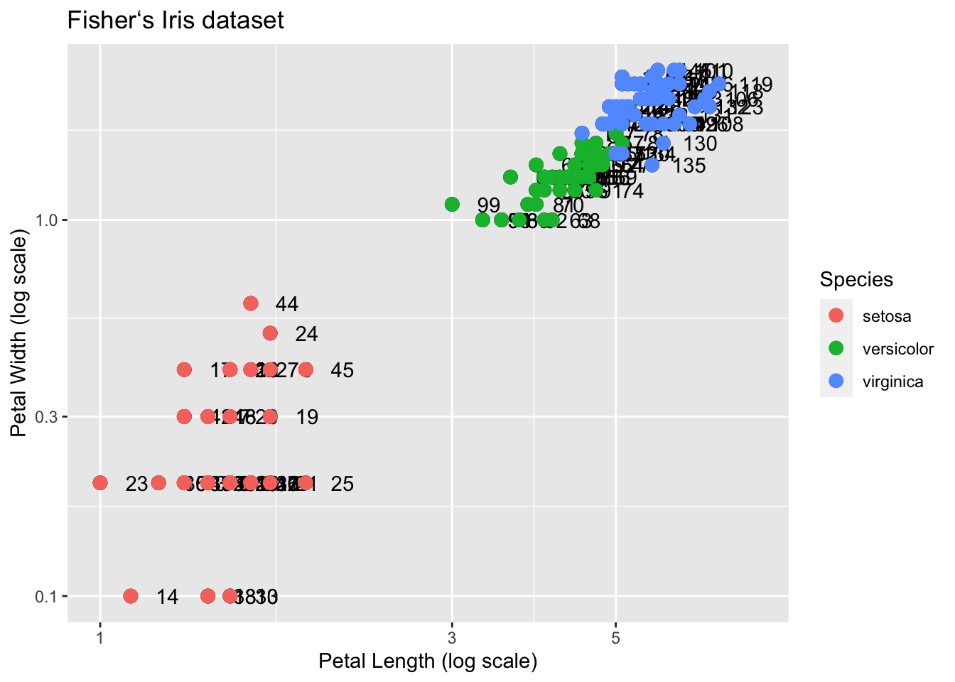
Why donʻt we need to supply the x and y? Those mappings are inherited from the global aes specification in p.
Suppose we wanted to use a custom color palette for our data. How do we specify them? Notice that the aes(col=Species) indicates which points are grouped by color according to the Species value. Nothing in the vector Species indicates a color.
Recall that Species is actually a factor, and so the values would be 1,2,3. How does this information get translated? In R, numbers are translated into a default color vector for plot.
The values of the colors we wish to use are specified in the scale parameter scale_color_manual. For these examples, letʻs go back to the untransformed values:
p + geom_point(aes(col=Species, size = 3)) +
  scale_color_manual(values=c("red", "blue", "purple"))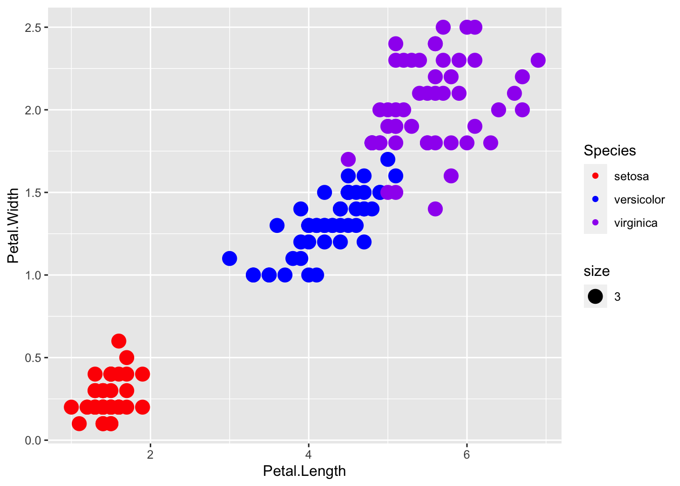
R has hundreds of named colors. You can see the names with the colors() function. There is a cool little function in the easyGgplot2 package that displays the colors. Now we have a lot of fancy colors to play with:
install.packages("remotes")
remotes::install_github("kassambara/easyGgplot2")easyGgplot2::showCols()
We can control which color is matched with which level of species. Looking at the help page for scale_color_manual, under values we see the explanation:
values
a set of aesthetic values to map data values to. The values will be matched in order (usually alphabetical) with the limits of the scale, or with breaks if provided. If this is a named vector, then the values will be matched based on the names instead. Data values that don’t match will be given na.value.
Letʻs use some of these fun colors, by creating a vector cols of color names and passing it to the values argument of scale_color_manual:
cols <- c("darkorange", "navyblue", "deeppink")

p + geom_point(aes(col=Species, size = 3)) +
  scale_color_manual(values=cols)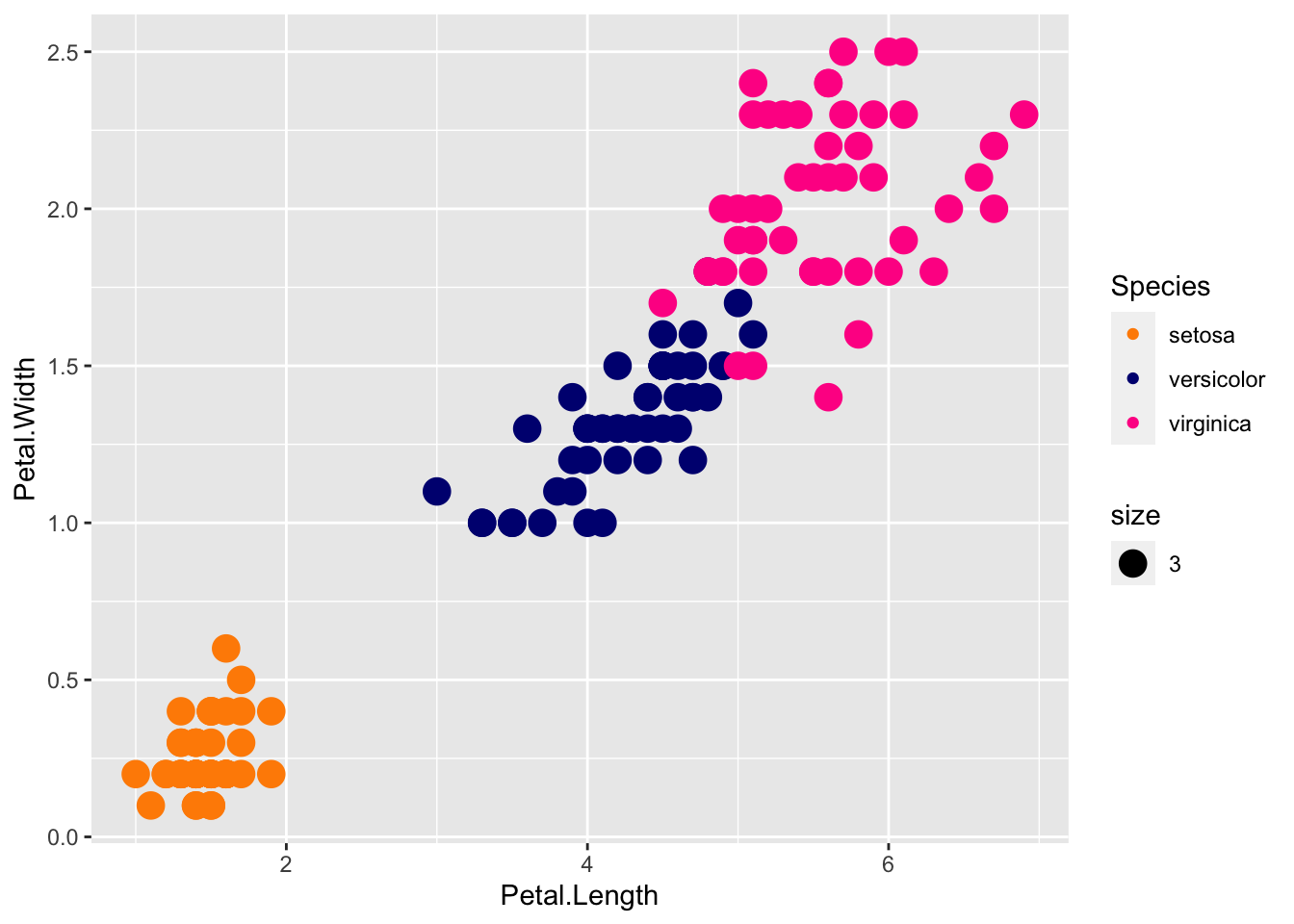
This is great! But what if we wanted to have pink on the bottom (setosa), orange in the middle (versicolor), and navy (virginica) on the top? Playing with the vector by trial and error always works, but what if we had a dozen species?
We can specify the match of colors to specific species by naming the cols vector with the species names. Then the cols vector will have color values, named by the species they represent:
cols <- c("darkorange", "navyblue", "deeppink")
names(cols) <- c("versicolor", "virginica", "setosa")

p + geom_point(aes(col=Species, size = 3)) +
  scale_color_manual(values=cols)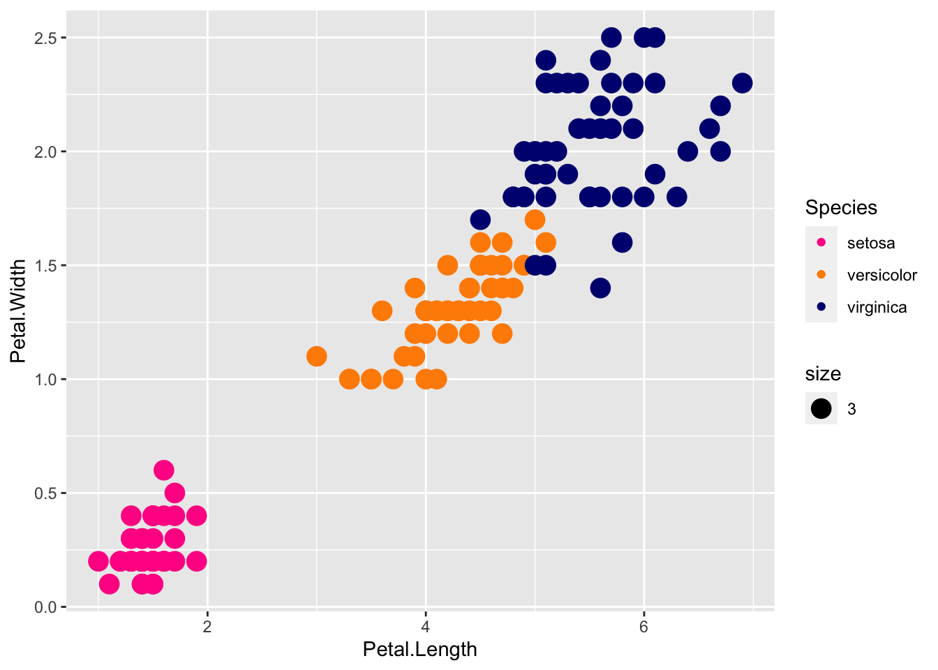
Voila! names(cols) and cols are a perfect example of a key - value pair.
The transparency of colors is controlled by the aesthetic alpha, where 1 indicates 100% opacity (or 0 transparency), with smaller decimals indicating more transparency.
p + geom_point(aes(col=Species, size = 3, alpha = 0.5)) +
  scale_color_manual(values=cols)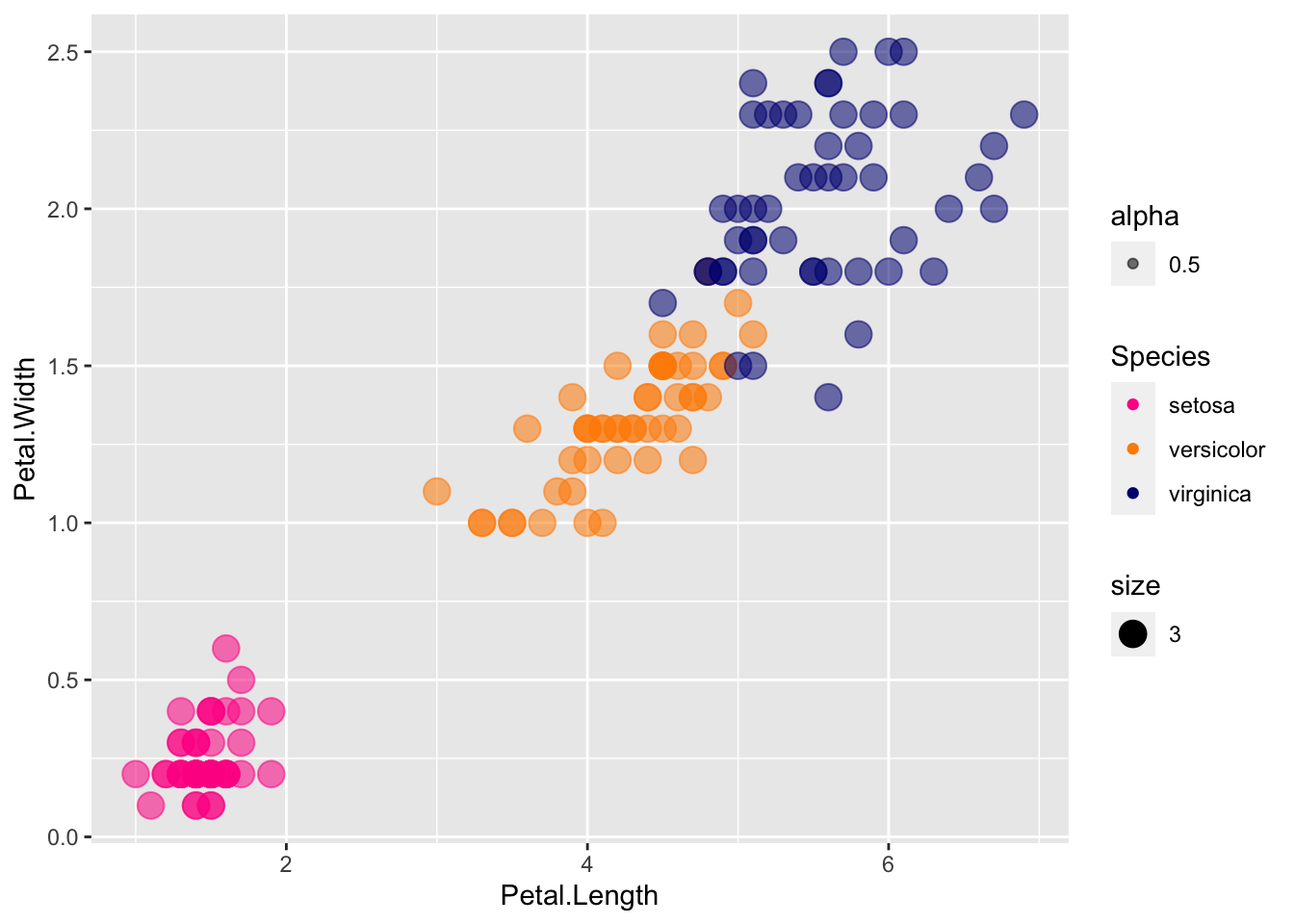
Transparency really helps with overlapping points.
Another way of dealing with overlapping points is to add a little random noise to each, called jitter. Try using geom_jitter instead of geom_point
p + geom_jitter(aes(col=Species, size = 3, alpha = 0.5)) +
  scale_color_manual(values=cols)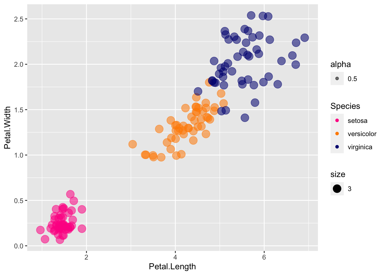
If you want to see where the jitter is relative to the true coordinates, you can use both:
p + geom_point() +
  scale_color_manual(values=cols) +
  geom_jitter(aes(col=Species, size = 3, alpha = 0.5))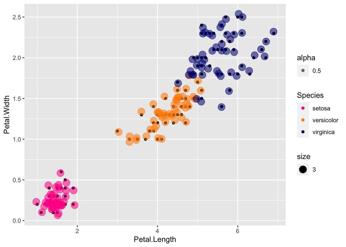
Here the true points are in color, and the jitter is shown in the smaller black points.
Jitter is fine for discrete values to spread it out for visualization (say jitter along the discrete axis but not the continuous axis), but not as ideal for metric data where distance along the axis really mean something.
Facets work great when they are subsets of the same data, but when you have different data or you want to apply different geoms or aesthetics and compare, you need a more general purpose panel system.
The cowplot package was written for arranging multiple plots. Letʻs compare what it looks like to jitter the black dots vs. jittering the transparent circles:
install.packages("cowplot")Loading required package: cowplotplot1 <- p + geom_point() +
scale_color_manual(values=cols) +
geom_jitter(aes(col=Species, size = 3, alpha = 0.5))
plot2 <- p + geom_point(aes(col=Species, size = 3, alpha = 0.5)) +
scale_color_manual(values=cols) +
geom_jitter()
plot_grid(plot1, plot2, labels="AUTO")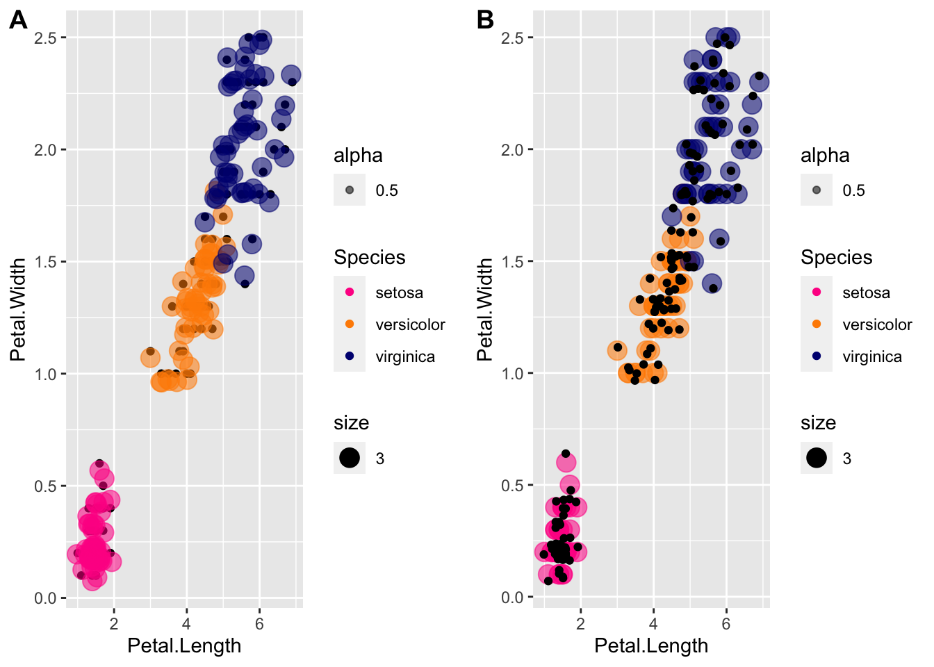
The labels arguement is to label the plots, for example for publication.
Another example, suppose we want to explore variation along Sepal.Length by Species:
plot1 <- ggplot(iris, aes(x = Species, y = Sepal.Length, fill=Species)) +
  geom_boxplot() +
  scale_color_manual(values=cols,  aesthetics="fill")

plot2 <- ggplot(iris, aes(x = Sepal.Length, fill = Species, col=Species)) +
  geom_density(alpha=0.5) +
  scale_color_manual(values=cols, aesthetics="fill") +
  theme(legend.position = c(0.8, 0.8))

plot_grid(plot1, plot2, labels="AUTO")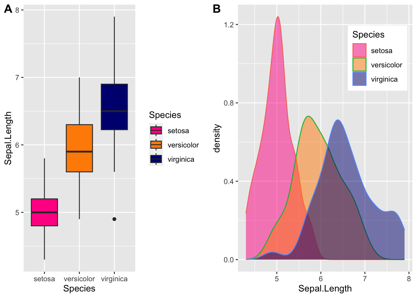
This is not quite right - we need to fix it! Please check the help pages.
We often want to add shapes or annotation to figures that are not derived directly from the aesthetic mapping; examples include labels, boxes, shaded areas, and lines.
geom_smooth() adds a smoothing line but the default is a loess smoother, which is flexible and nonparametric but might be too flexible for our purposes.
p + geom_point(aes(col=Species), size = 3) +
    geom_smooth()
`geom_smooth()` using method = 'loess' and formula = 'y ~ x'Warning: The following aesthetics were dropped during statistical transformation: label
ℹ This can happen when ggplot fails to infer the correct grouping structure in
the data.
ℹ Did you forget to specify a `group` aesthetic or to convert a numerical
variable into a factor?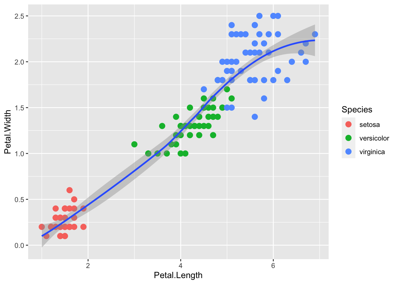
We get a warning because we are not using the label aesthetic (remember it is =id). There is no problem but to stop the annoying warnings, letʻs leave off label until we need it.
If we want to explain a simple linear trend between the x and y variables, perhaps we’d prefer a linear regression line.
p <- iris |> ggplot(aes(x = Petal.Length, y = Petal.Width))

p + geom_point(aes(col=Species), size = 3) +
    geom_smooth(method="lm")
`geom_smooth()` using formula = 'y ~ x'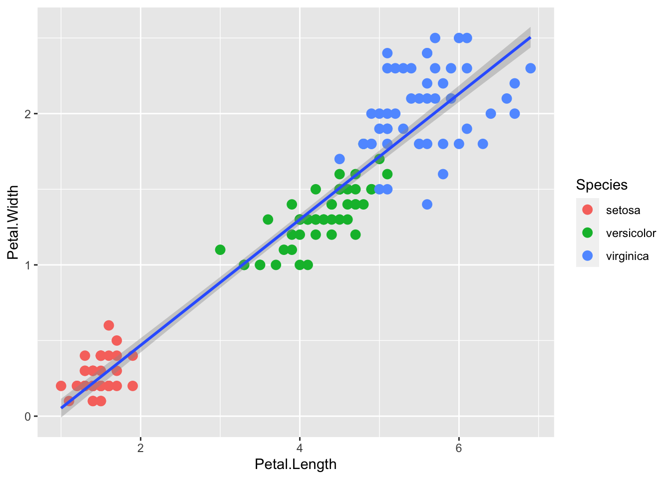
Or without the standard error envelope:
p + geom_point(aes(col=Species), size = 3) +
    geom_smooth(method="lm", se=FALSE)
`geom_smooth()` using formula = 'y ~ x'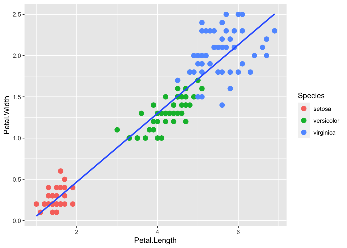
We can also compute the regression separately and add the line using geom_abline(), similar to the base R abline() function. Note: the ab in the name is to remind us we are supplying the intercept (a) and slope (b).
lm.fit <- lm(iris$Petal.Width ~ iris$Petal.Length)

p + geom_point(aes(col=Species), size = 3) +
    geom_abline(intercept = coef(lm.fit)[1], slope= coef(lm.fit)[2])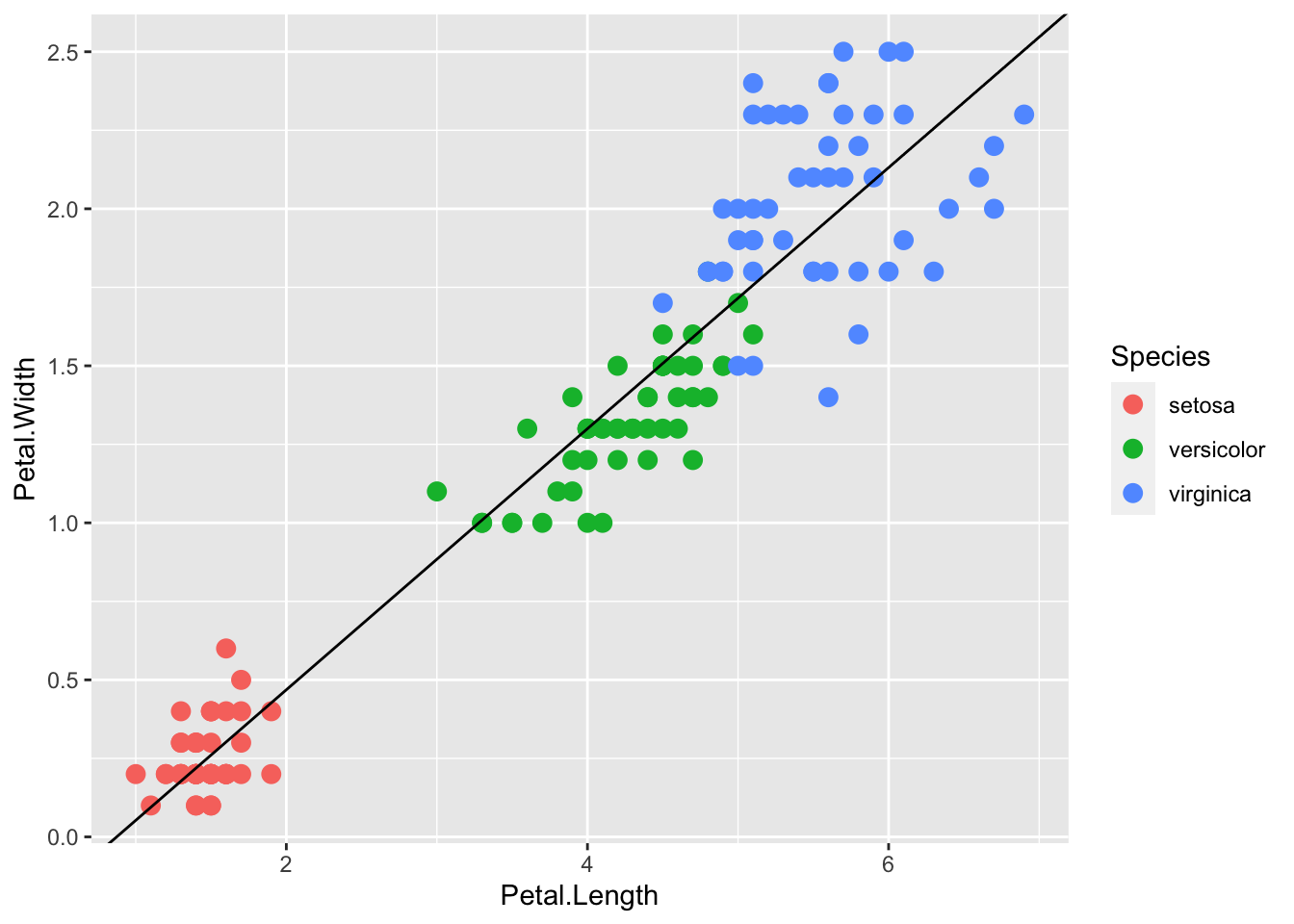
Here geom_abline() does not use any information from the data object, only the regression coefficients.
We can change the line type and color of the lines using arguments. Also, we draw it first so it doesn’t go over our points.
p + geom_abline(intercept = coef(lm.fit)[1],
                slope= coef(lm.fit)[2],
                lty = 2,
                color = "darkgrey") +
geom_point(aes(col=Species), size = 3) 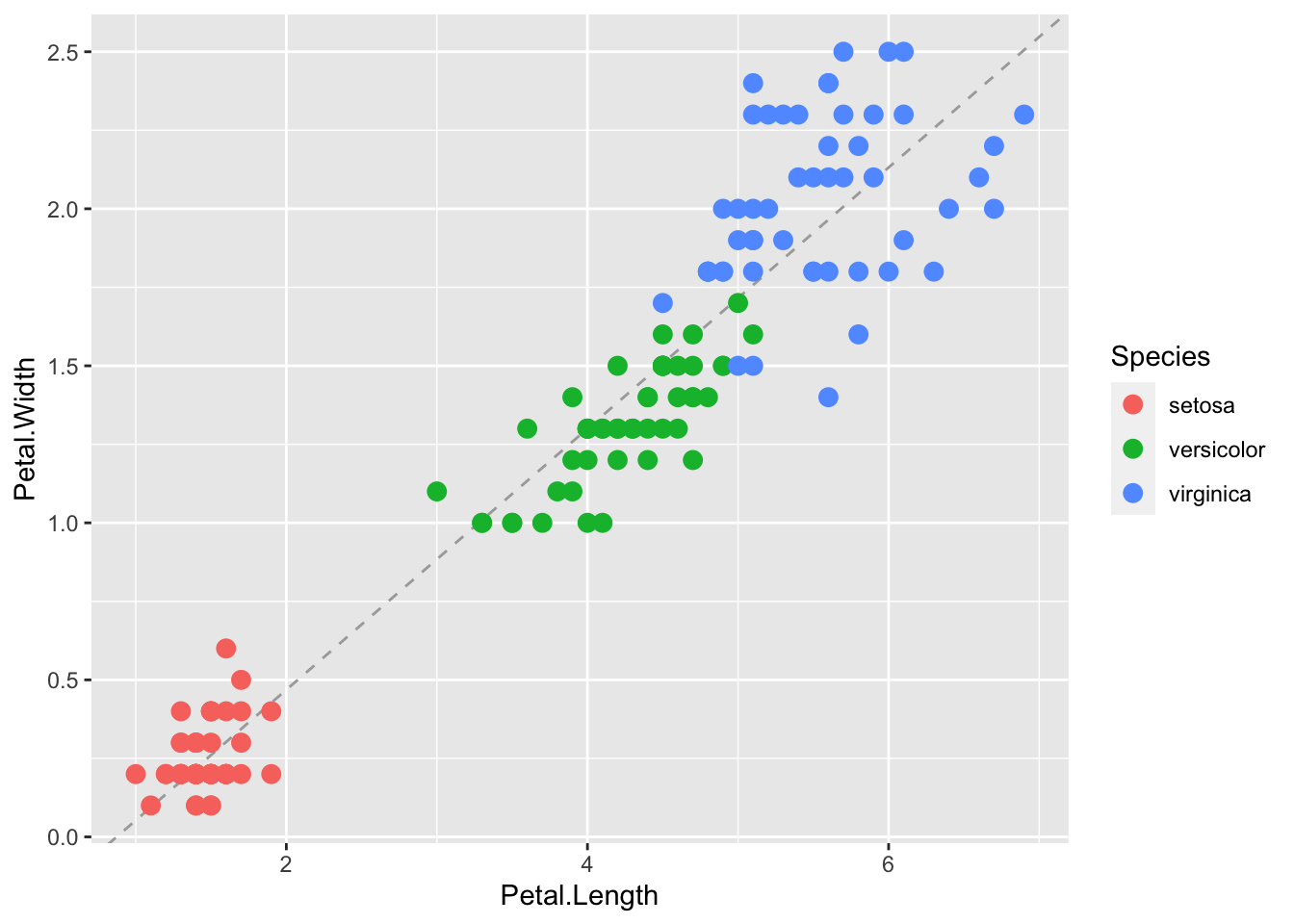
We can see that although the three species of iris generally fall along a line, that there are clusters by species. Perhaps separate linear models by group may be a better fit.
There are two ways that we can do this. The first is to put a grouping aesthetic within the smoother.
p + geom_point(aes(col=Species), size = 3) +
    geom_smooth( aes(group=Species), method="lm")
`geom_smooth()` using formula = 'y ~ x'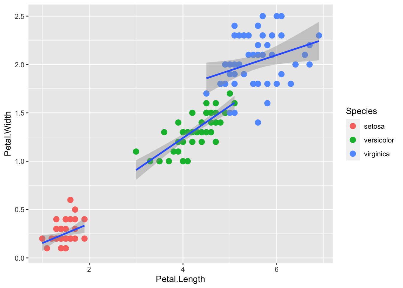
Another way to do this is to add col (here as a grouping variable) in the global ggplot aesthetic, which will apply to all downstream layers:
r <- iris |> ggplot(aes(x = Petal.Length, y= Petal.Width, col=Species))

r + geom_point(aes(col=Species), size = 3) +
    geom_smooth( method="lm")
`geom_smooth()` using formula = 'y ~ x'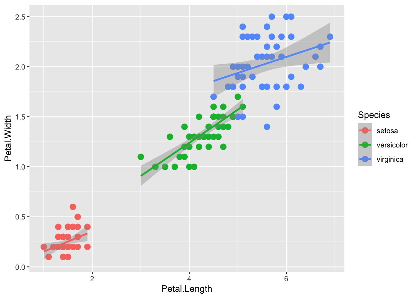
Facets are what ggplot calls multi-panel plots. They split the data by some factor, which can be very helpful for viewing varition of subsets of the data.
The two main functions are facet_wrap() and facet_grid()
facet_wrap() lays the panels out in a ribbon, in sequential order. See the documentation for arguments to control the number of rows or columns, etc.
The faceting variable (here, Species) is using formula syntax ~Species.
p + geom_point(aes(col=Species), size = 3) +
   geom_smooth( method="lm") +
   facet_wrap(~Species)
`geom_smooth()` using formula = 'y ~ x'
facet_grid() is explicity a grid. The syntax . ~ Species facets by column. a
p + geom_point(aes(col=Species), size = 3) +
   geom_smooth( method="lm") +
   facet_grid(. ~ Species)
`geom_smooth()` using formula = 'y ~ x'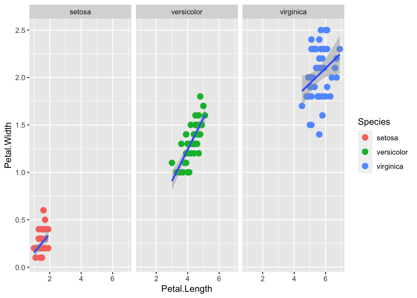
The syntax Species ~ . facets by row. The syntax Y ~ X would facet by rows and columns.
p + geom_point(aes(col=Species), size = 3) +
   geom_smooth( method="lm") +
   facet_grid(Species ~ .)
`geom_smooth()` using formula = 'y ~ x'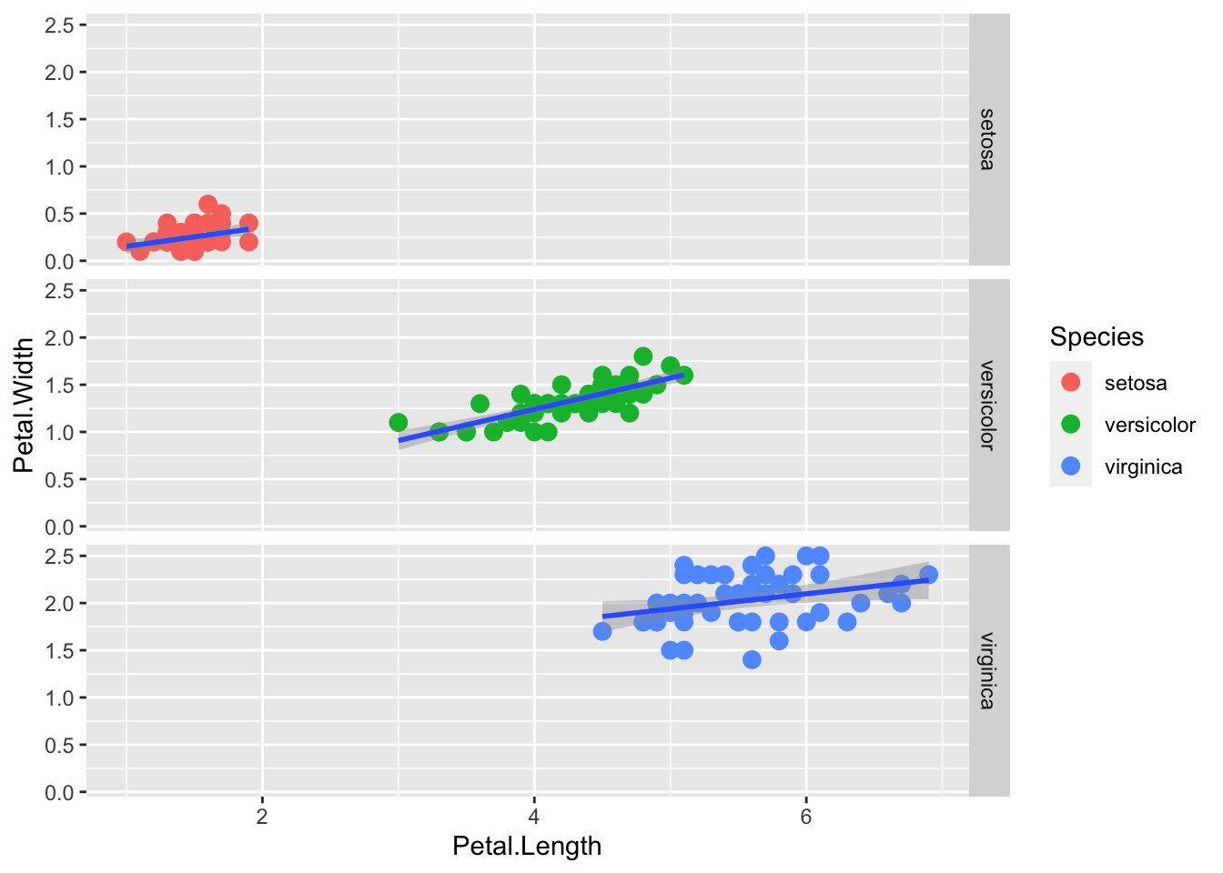
The default plots created by ggplot2 are already very useful. However, we frequently need to make minor tweaks to the default behavior. Although it is not always obvious how to make these even with the cheat sheet, ggplot2 is very flexible.
For example, we can make changes to the legend title via the scale_color_discrete function():
p + geom_point(aes(col=Species), size = 3) +
scale_color_discrete(name = "Iris Varieties") 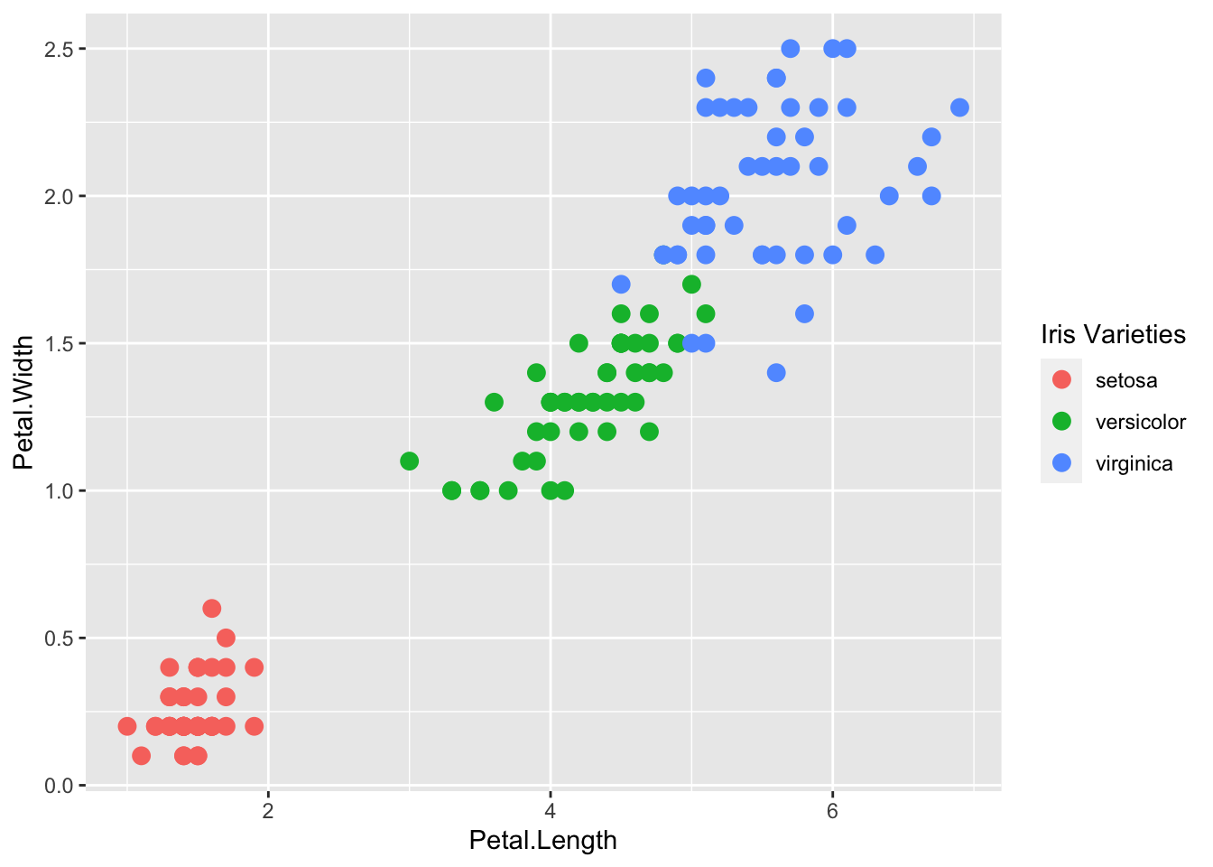
ggplot2 automatically adds a legend that maps color to species. To remove the legend we set the geom_point() argument show.legend = FALSE.
p + geom_point(aes(col=Species), size = 3, show.legend=FALSE)The default theme for ggplot2 uses the gray background with white grid lines.
If you don’t like this, you can use the black and white theme by using the theme_bw() function.
The theme_bw() function also allows you to set the typeface for the plot, in case you don’t want the default Helvetica. Here we change the typeface to Times.
For things that only make sense globally, use theme(), i.e. theme(legend.position = "none"). Two standard appearance themes are included
theme_gray(): The default theme (gray background)theme_bw(): More stark/plainp +
geom_point(aes(color = Species)) +
theme_bw(base_family = "Times")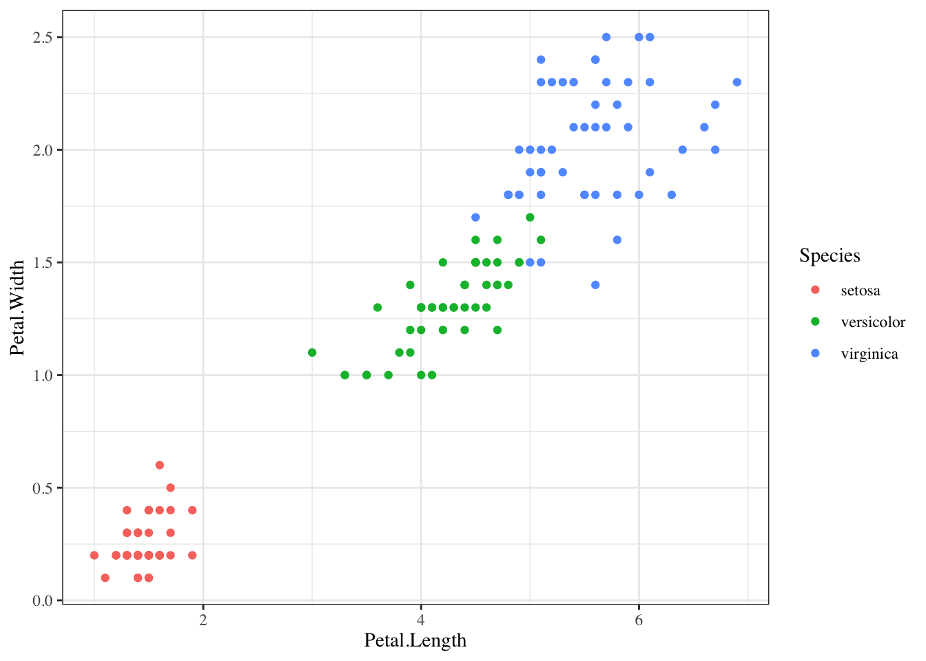
The power of ggplot2 is augmented further due to the availability of add-on packages. The remaining changes needed to put the finishing touches on our plot require the ggthemes and ggrepel packages.
The style of a ggplot2 graph can be changed using the theme functions. Several themes are included as part of the ggplot2 package.
Many other themes are added by the package ggthemes. Among those are the theme_economist theme that we used. After installing the package, you can change the style by adding a layer like this:
Loading required package: ggthemes
Attaching package: 'ggthemes'The following object is masked from 'package:cowplot':
theme_mapp + geom_point(aes(col=Species, size = 3, alpha = 1/2)) +
scale_color_manual(values=cols) +
theme_economist()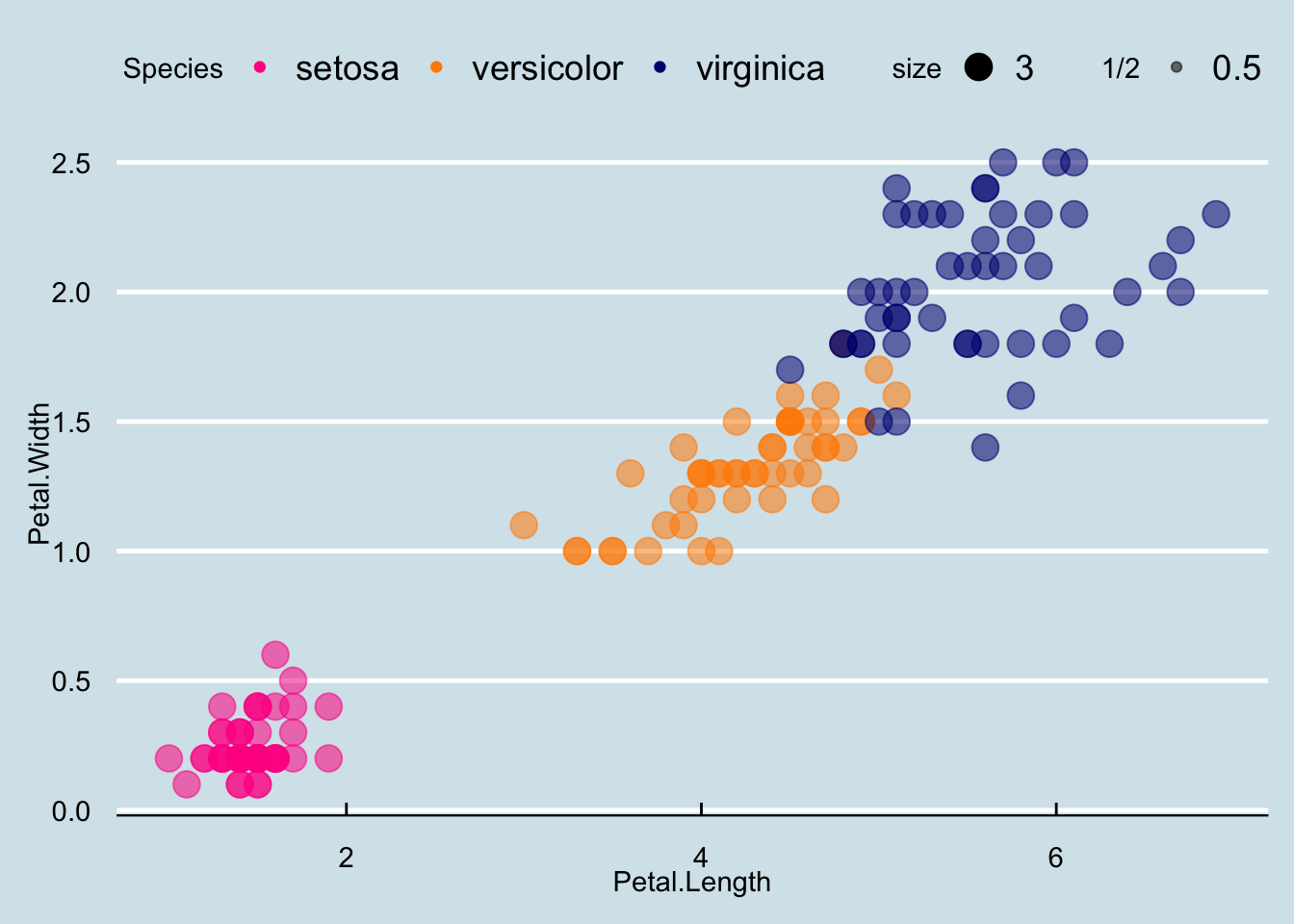
You can see how some of the other themes look by simply changing the function. For instance, you might try the theme_fivethirtyeight() theme instead.
ggrepel
The final difference has to do with the position of the labels. In our plot, some of the labels fall on top of each other. The package ggrepel includes a geometry that adds labels while ensuring that they don’t fall on top of each other. We simply change geom_text with geom_text_repel.
Loading required package: ggrepelp + geom_point(aes(col=Species, size = 3, alpha = 1/2)) +
scale_color_manual(values=cols) +
theme_economist() +
geom_text_repel(aes(Petal.Length, Petal.Width, label = id))Warning: ggrepel: 90 unlabeled data points (too many overlaps). Consider
increasing max.overlaps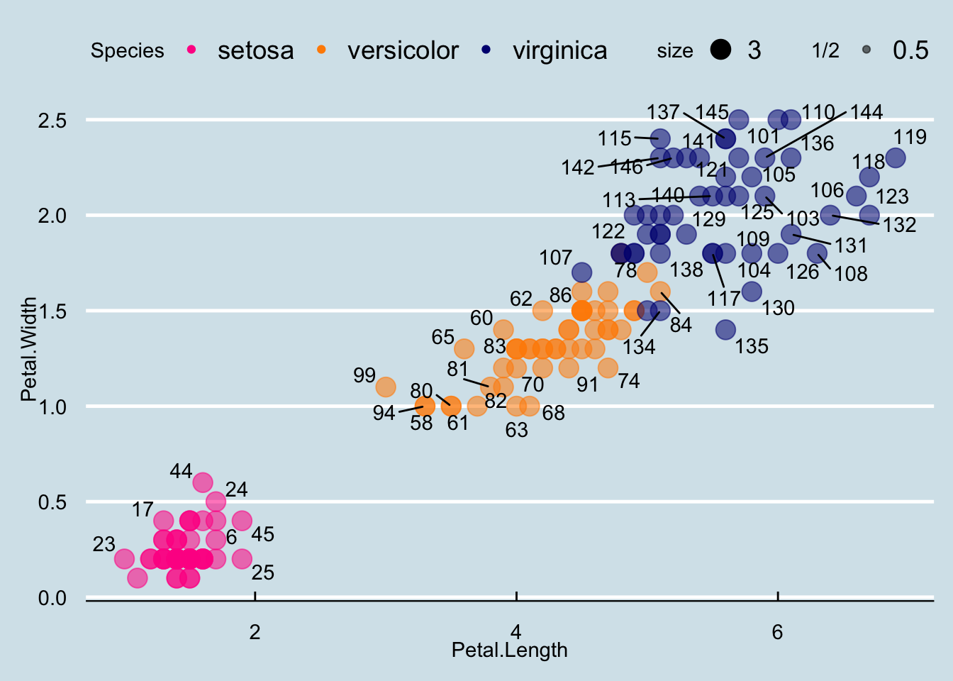
Now that we are done testing, we can write one piece of code that produces our desired plot from scratch.
iris$id <- 1:length(iris$Species)
cols <- c("darkorange", "navyblue", "deeppink")
names(cols) <- c("versicolor", "virginica", "setosa")

iris |> ggplot(aes(x = Petal.Length, y = Petal.Width, col=Species)) +
  geom_point(aes(size=3, alpha=1/2)) +
   geom_smooth(method="lm") +
  scale_color_manual(values=cols) +
  theme_economist()
`geom_smooth()` using formula = 'y ~ x'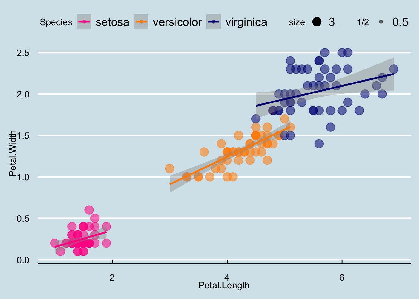
I left off the point labels because itʻs too busy, but you can modify as you wish! It is often useful to label points when you are data cleaning or if you are interested in highlighting certain points. In that case, you could label only specific points.
You can save your plots using the base R pdf() and dev.off() combination, opening the device, printing your plots, then closing the device.
There is also a ggsave() function specifically to save ggplot objects to different format. Check out the help page for it.
mtcars dataset or any new dataset.